Hint: It’s not “What’s my style?”
When it’s time to update your home—or you’re building a new one—it’s tempting to start your journey by trying to define your decorating style.
Whether your style is traditional, modern, cottage-cozy, or something else, a better first question is:
“How do I want to feel in my home?”
This is one of the most important decisions you’ll make. Style describes the look of a space, but it doesn’t define the feeling. For instance, a traditional home can feel crisp, light, and fresh, or it can also feel warm, layered, and earthy. The same is true for cottage, modern, or transitional styles.
In fact, most homes tend to fall somewhere along a spectrum between two distinct feeling-based approaches: fresh and earthy.
So instead of asking, “What’s my style?” try asking, “How do I want to feel when I walk through my front door?”
Take a look at the following lists.
Which group of words resonates most with you when you imagine yourself walking into your newly renovated space?
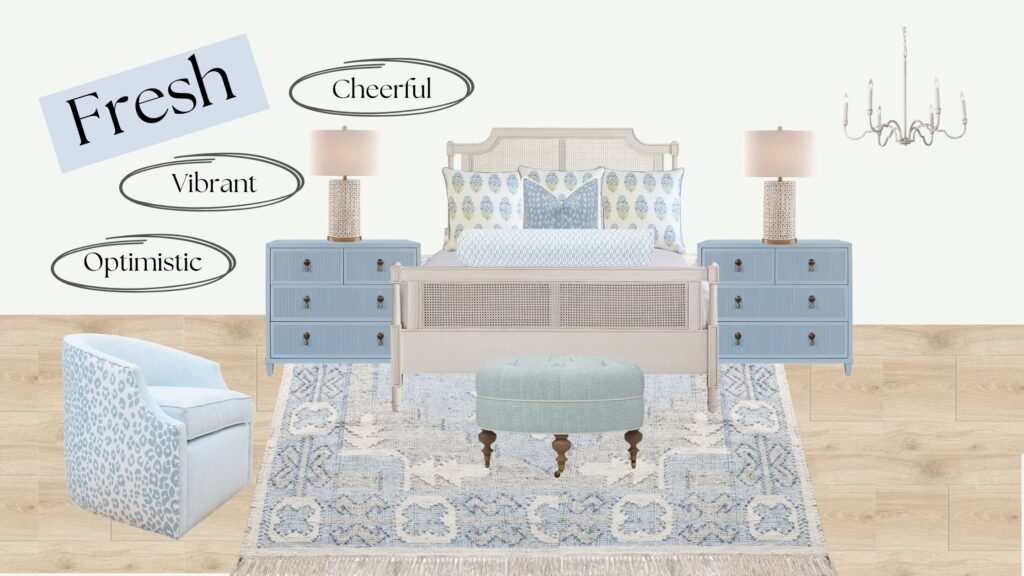
Fresh
- Cheerful
- Energizing
- Optimistic
- Playful
- Vibrant
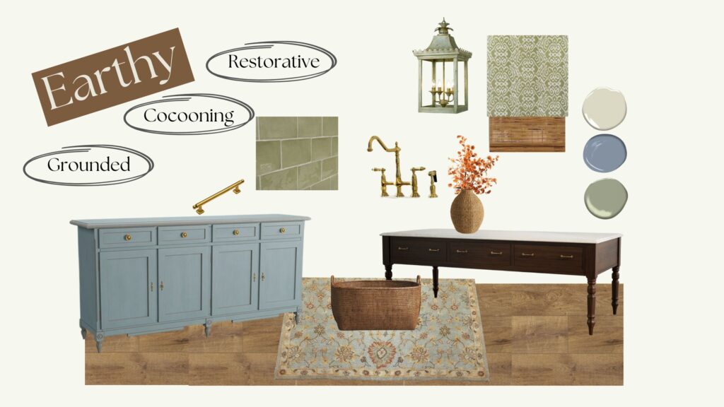
Earthy
- Organic
- Restorative
- Cocooning
- Grounded
- Muted
The first decision is how you want your home to feel.
If you’re naturally drawn to one category over the other, you’ve already taken the first step toward creating a home that feels authentically yours.
Once you know the feeling you’re trying to create, everything else—from paint colors and countertops and tile, to fabrics and furnishings—becomes much easier to evaluate with confidence. The choice between fresh and earthy becomes the lens through which every design decision is made, helping create a home that not only looks beautiful, but makes you feel exactly the way you want to feel in it.
Instead of asking, “Do I like this tile?” you’ll start asking, “Does this tile fit the overall feeling I’m trying to create?”
So what actually makes a room feel fresh or earthy?
Colors
Much of it comes down to the character of the colors you choose. Fresh colors tend to be cleaner and more saturated, while earthy colors are softened and muted. Understanding this distinction makes it much easier to recognize why certain paint colors, fabrics, rugs, and finishes naturally work together.
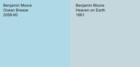
The higher color saturation in fresh colors doesn’t mean they are darker, it means they are crisp and intense compared to earthy colors which are more muted.
Here is an example of two blue paint colors by Benjamin Moore. They have a very similar LRV (light reflective value) so one color is not significantly lighter or darker than the other. Ocean Breeze, however, is a much more saturated color (crisper and more intense), making it a fresh color. Heaven on Earth in comparison is earthier and muted.
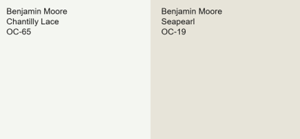
Neutrals
When it comes to neutrals, a fresh décor perspective relies on brighter, cooler whites while earthy decorating uses creamier whites with a yellow or very light brown undertone.
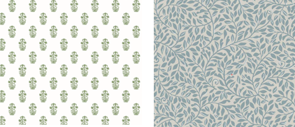
Patterns
When choosing rugs, fabrics, wallpaper and even art, pay attention to the ground or background color in the pattern. Items that work well with a fresh decorating perspective tend to have a whiter ground while earthy pieces have a more yellow, brown or gray undertones in the ground (background).
Here is an example in two wallpaper options. One with a white ground and one with gray.
Most homes include a mix of both fresh and earthy elements, but one direction should lead. Without that clarity, a home can feel off. In particular, earthy finishes can start to look dull or even dirty when placed next to crisp, fresh colors. It’s something to consider if you have a room that feels off but you can’t pinpoint why.
Once you identify your home’s dominant direction, you can make all the other decisions for your home through a new lens of clarity.
Now let’s look at some inspirational images.
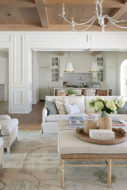
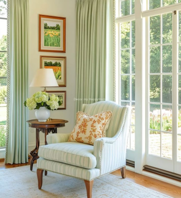
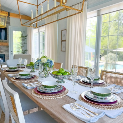
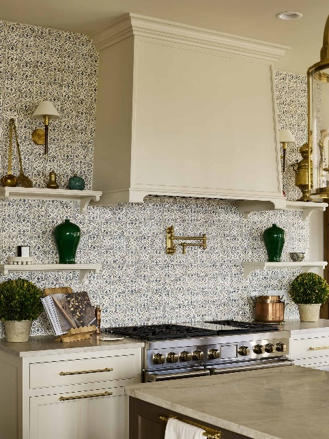
Examples of fresh and energetic decorating.
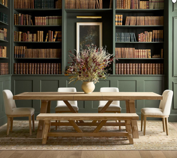
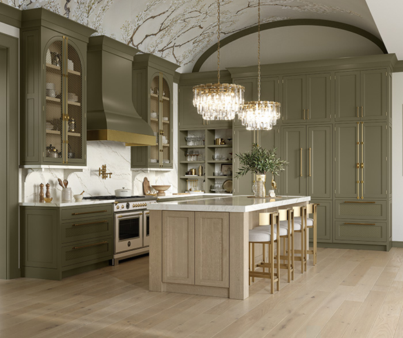
A few example of an earthy and organic decorating approach.
Once you have determined whether you’re drawn to fresh or earthy interiors, decorating decisions become much easier because you have a clear lens for every choice.
Instead of asking, “Do I like this tile?” you’ll start asking, “Does this fit the overall feeling I’m trying to create?”
If you desire a cheerful and vibrant experience in your home, you will want to consider brighter whites and crisp colors. If a big, cozy hug is the feeling you want your home to give, then you’ll lean toward creamier whites, olive greens, warm beiges, and more weathered tones.
Remember, your first question should be “How do I want to feel when I walk through my front door?” The answer to that question will work with any style!
For more inspiration of a fresh approach to decorating, check out https://www.wellappointedhouse.com/
For additional inspiration of an earthy decorating approach, go to https://amberinteriordesign.com/projects
Charm By Design Interiors
Specializing in timeless charm
Proudly powered by WordPress